The Death of the Grid: Why 2026 Websites Are Going “Bento” and Biomorphic
The Era of Digital Comfort
If you look at the websites dominating the award circuits in 2026, you will notice a stark absence of the rigid, symmetrical rows that defined the early 2020s. We have entered the age of “Digital Comfort.” After years of sterile minimalism, users are craving warmth, depth, and organic interaction. At MM Dev, we are seeing a massive pivot toward two conflicting yet complementary trends: the structured chaos of the Bento Grid and the fluid humanity of Anti-Grid Design.
What is the Bento Grid? Inspired by the Japanese lunchbox, the Bento Grid is a modular layout style that compartmentalizes content into boxes of varying sizes. Unlike a traditional list or a standard 3-column grid, a Bento layout allows for a hierarchy of information that feels curated rather than calculated.
Mobile-First Mastery: The genius of the Bento Grid lies in its responsiveness. On a desktop, it looks like a sophisticated dashboard. On a mobile device, the boxes stack seamlessly without losing their visual impact. It creates a “card-based” experience that modern users—trained by social media feeds—find intuitive.
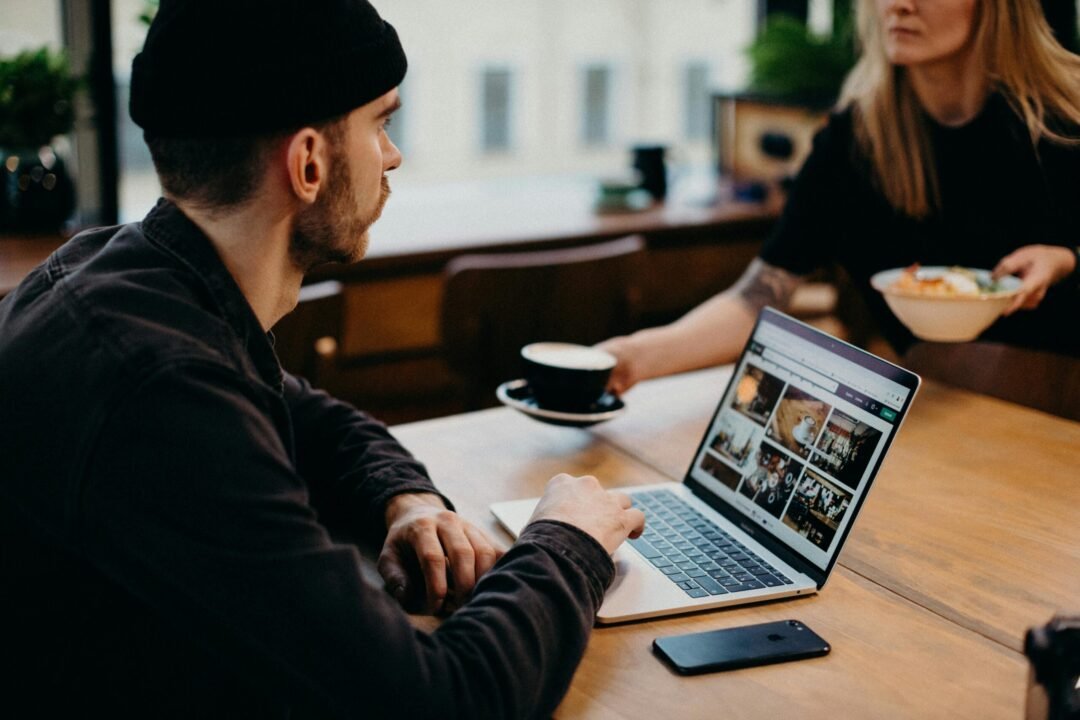
Content Variety: It allows us to mix media types effortlessly. A video loop can sit next to a static statistic, which sits below a testimonial. It breaks the monotony of text-heavy pages.
The Anti-Grid Movement: Making Pixels Feel Human
While Bento brings order, the “Anti-Grid” movement brings soul. 2026 is the year we break the straight line.
Fluid Shapes & Biomorphism: We are replacing sharp corners with organic, blob-like shapes that morph and breathe as the user scrolls. These “fluid shapes” reduce visual tension and make the digital environment feel more natural and less mechanical.
The “Human Scribble”: In a world flooded with AI-generated imagery, the ultimate luxury is the human touch. We are integrating hand-drawn elements—arrows, circles, and annotations—that look like they were sketched on the screen. This “Human Scribble” trend builds subconscious trust; it tells the visitor that a human being, not a bot, crafted this experience.
Why This Matters for Your Bottom Line Design is not just decoration; it is credibility. A study of 2026 consumer behavior shows that users judge a company’s technological competence based on their visual presentation within the first 50 milliseconds. If your site looks like a template from 2022, clients assume your business practices are equally outdated. Upgrading to a Bento or Organic layout signals innovation, adaptability, and attention to detail.
FAQs
A: A Bento Grid is a modular design trend popular in 2026 that organizes content into rectangular compartments of varying sizes, similar to a Japanese bento box. It is highly effective for creating mobile-responsive, dashboard-style interfaces.
Q: Why are organic shapes trending in 2026?
A: Organic, fluid shapes are trending because they counter the “AI fatigue” users feel. They introduce a human, natural element to digital interfaces, referred to as “Digital Comfort,” which reduces cognitive load and increases emotional connection.